
Matchmaking! I choose you!
* * * Design work presented reflects my specific contributions during the project tenure. All trademarks and final production implementations remain the property and responsibility of the respective owners.
* * * Design work presented reflects my specific contributions during the project tenure. All trademarks and final production implementations remain the property and responsibility of the respective owners.
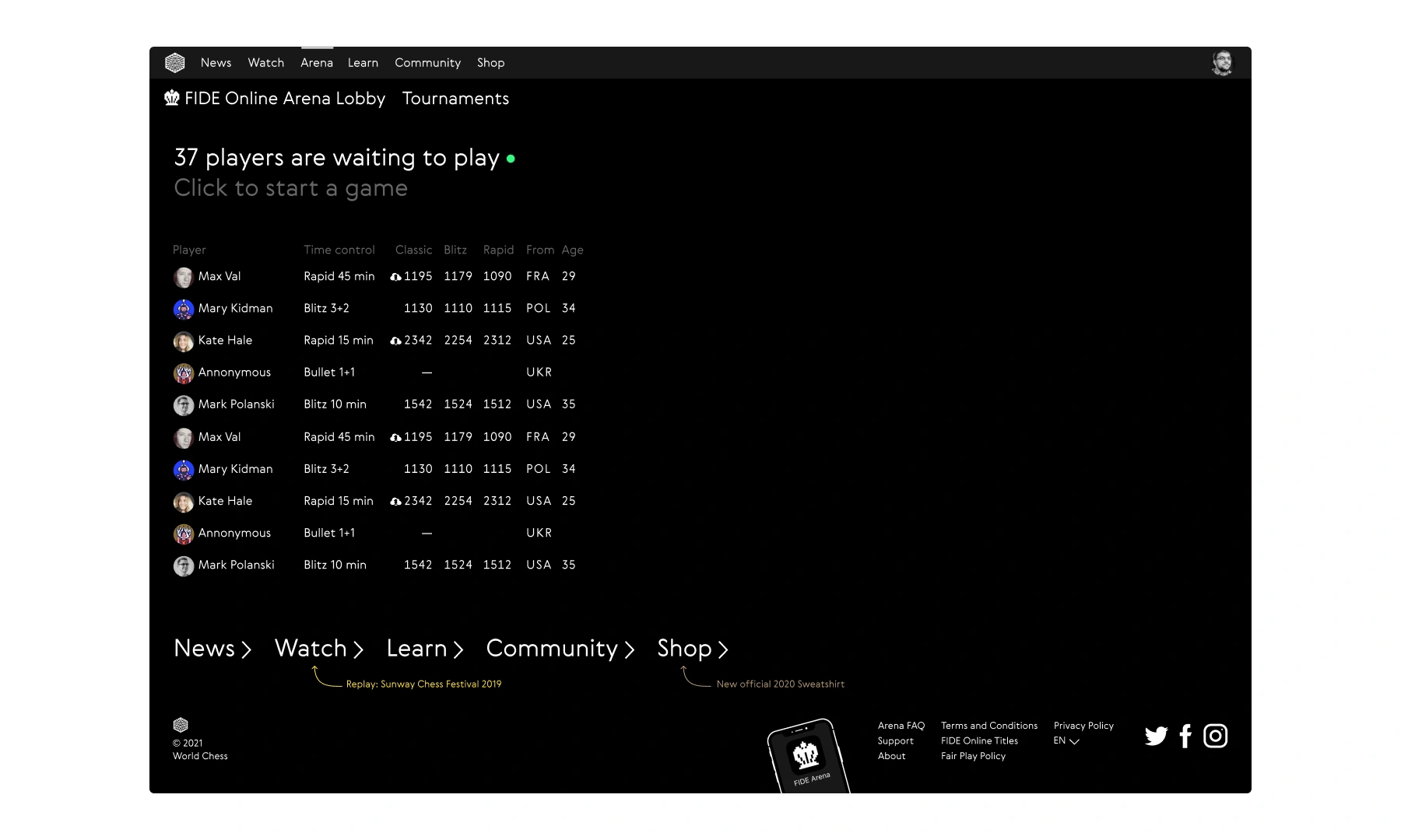
The old Lobby was just a single, fast-moving list. Games jumped so quickly that players couldn’t track time controls or see who they were joining. The interface felt empty even during peak hours. From a business side, we needed a way to introduce new game modes, handle multiple match requests at once, and integrate AI opponents.
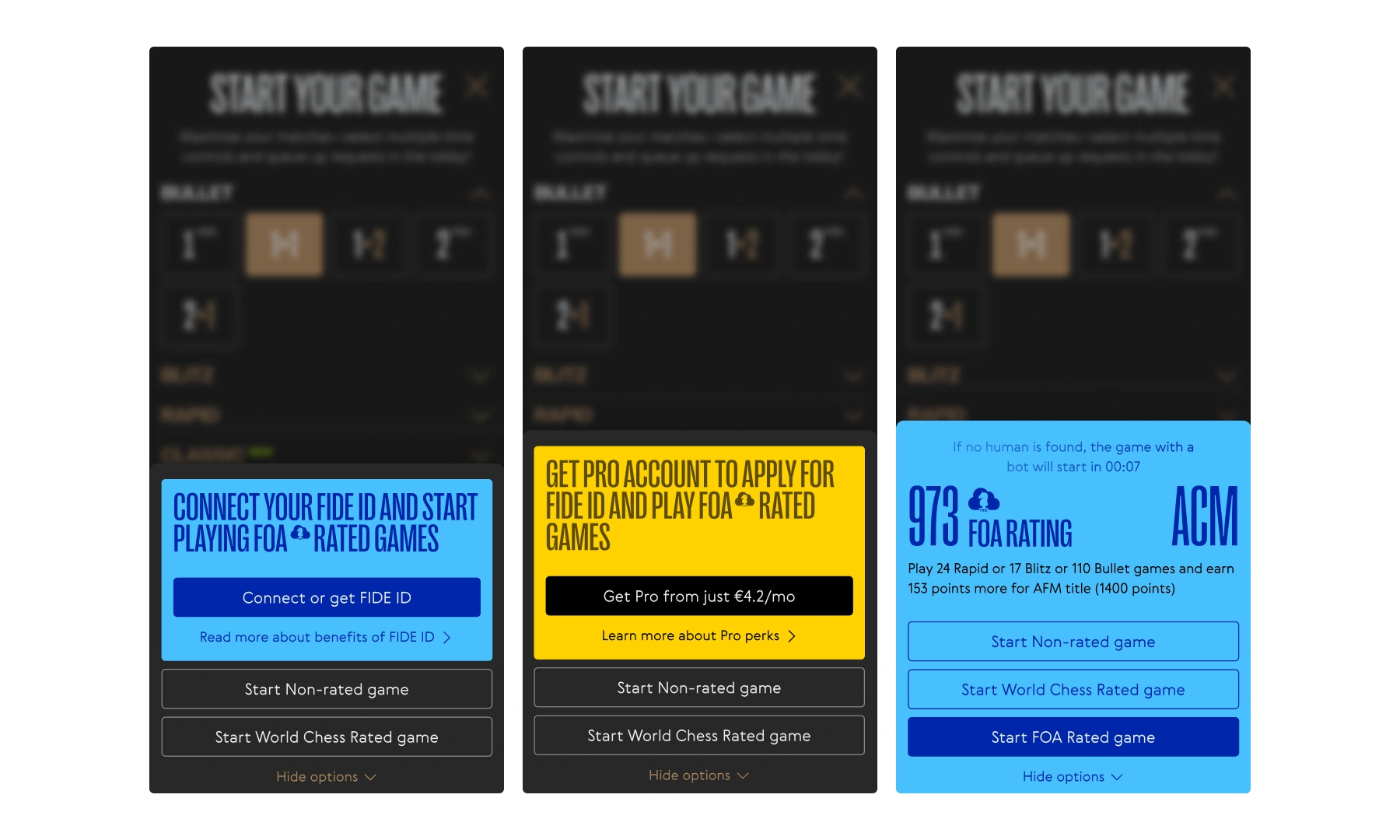
I started by mapping out every possible system state: anonymous users, free vs. PRO accounts, FIDE-connected profiles, and bot fallbacks for when no opponent was found. This defined exactly what each user type would see in the Lobby and during game creation.
I tested several layouts for the active games list. Accordions didn't work because the fast-moving content caused too many layout jumps. A standard table was also too hard to filter. I settled on a multi-column grid where each column represents a specific time control. This let players stay focused on their preferred style and gave us a clear way to highlight FIDE-rated games with their own colors and lock logic.
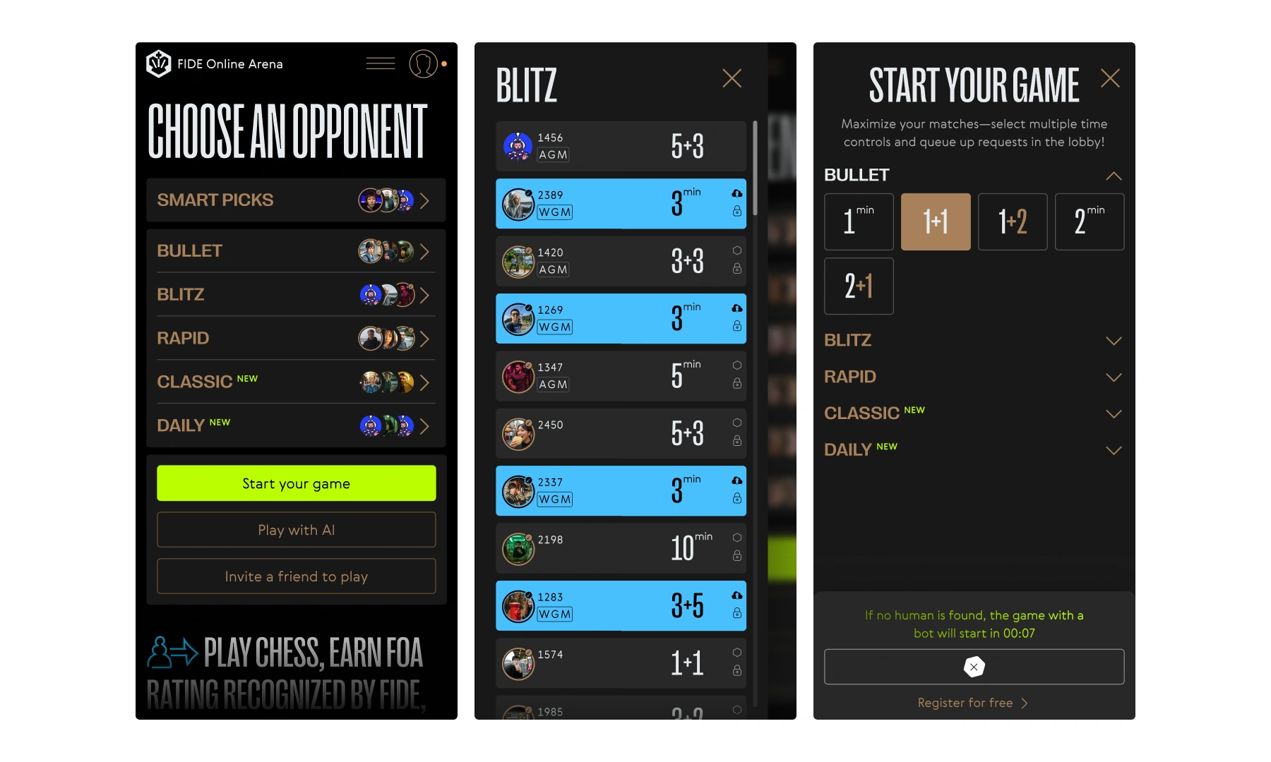
On mobile, I changed the logic. Columns became separate category pages because nested scrolling was a mess. Start Your Game was moved to its own page with collapsible sections to save vertical space. Because of API limits, we used static avatars to keep a sense of presence without the technical overhead of real-time syncing.

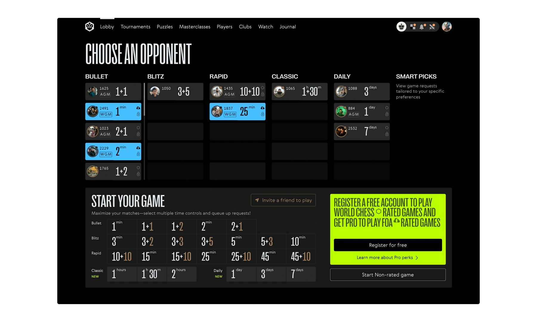
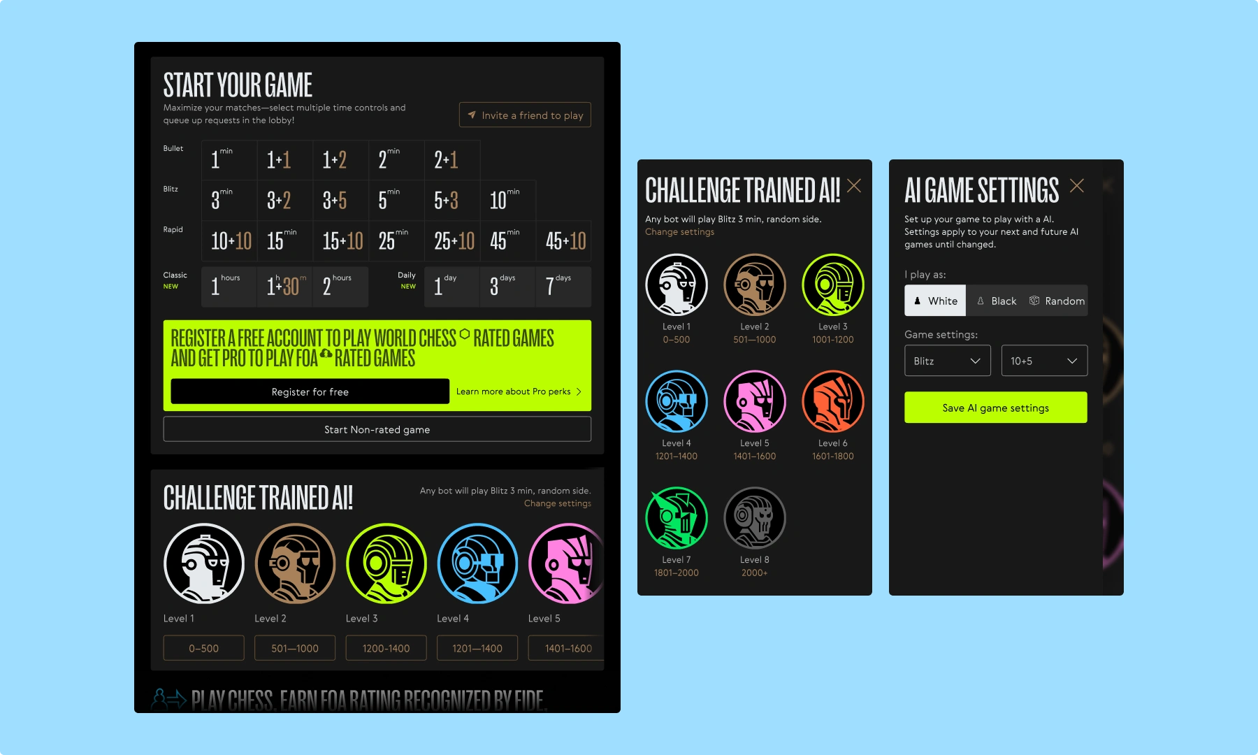
The new Lobby became a proper control room. It’s a place to build matches that fit your tempo, rating, and preferences. Quick invites, customisable bots, and smart suggestions now have their own space. Over 60% of players said the update made things better. The new foundation is ready for new features and higher loads.