
Grab-to-fridge optimisation
* * * Design work presented reflects my specific contributions during the project tenure. All trademarks and final production implementations remain the property and responsibility of the respective owners.
* * * Design work presented reflects my specific contributions during the project tenure. All trademarks and final production implementations remain the property and responsibility of the respective owners.
BLIZKO MARKETS operates micromarket stands in high-traffic shared spaces like apartment buildings and universities. The client needed a UI built from scratch to replace a broken system plagued by abandoned purchases and scanning errors.
The stakes were high: users expect a "grab and go" experience, not a learning curve. If the interface fails to earn trust in the first few seconds, the user is lost for good. I approached this as a hardware-to-human optimisation problem, focusing on stopping people from yanking fridge doors before they unlocked and reducing the friction between spotting a product and completing a payment.
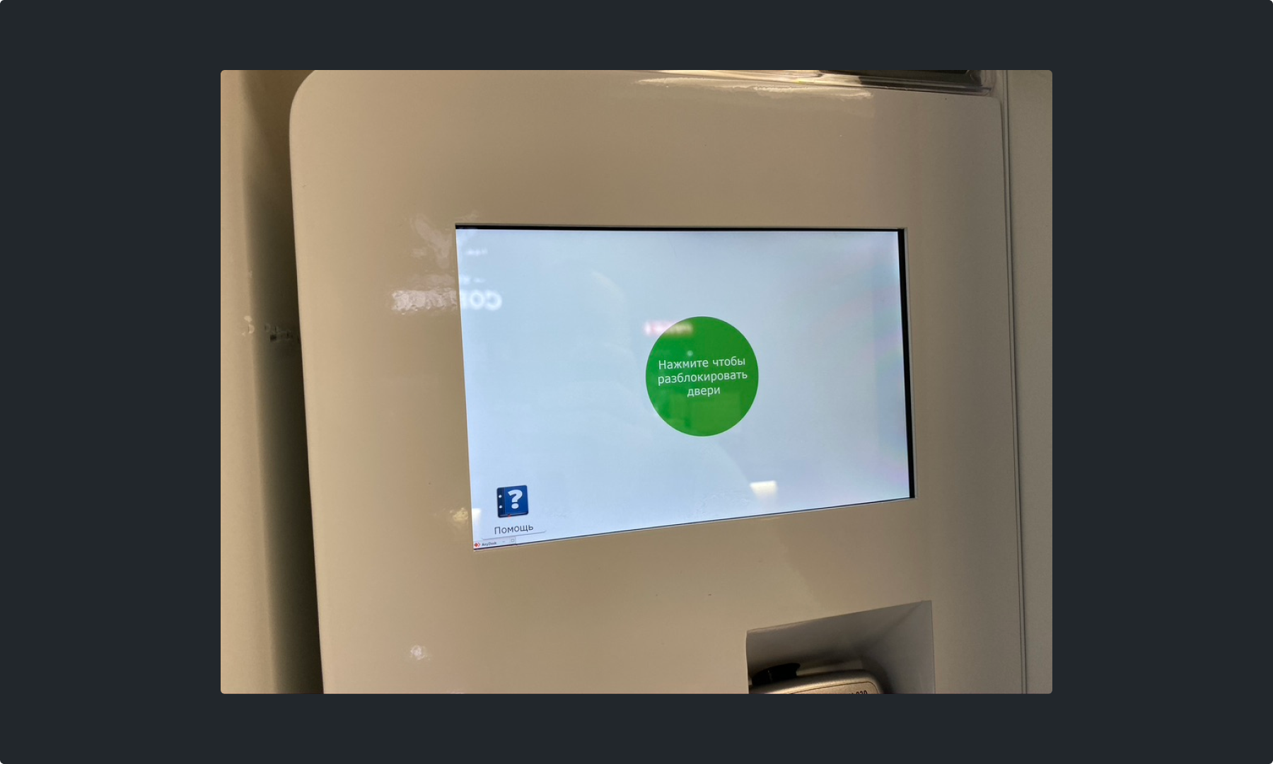

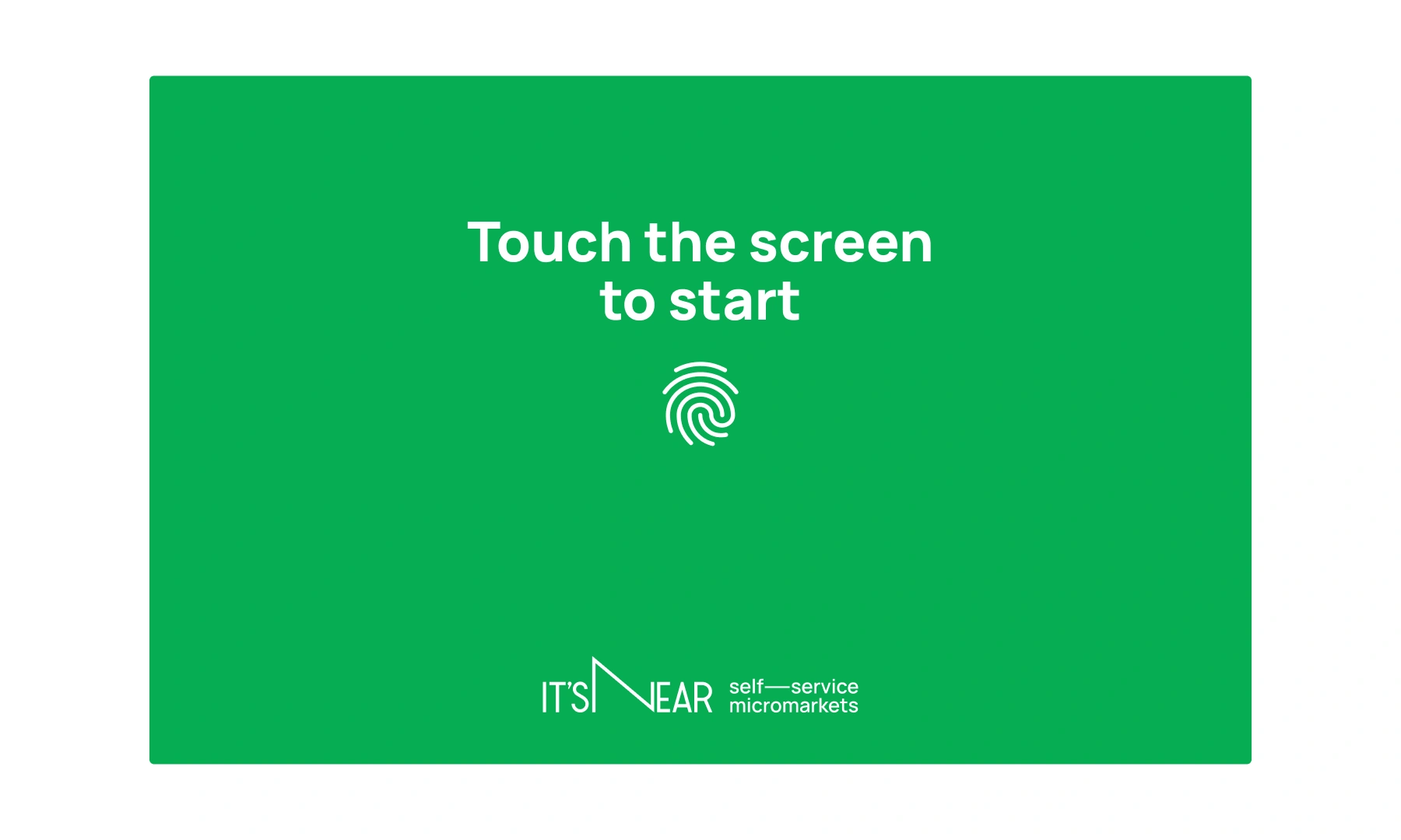
The first issue was the lock screen. It was often either turned off or showing small text on a white background, making the machine look broken. I had the dev team set the screen to always-on and designed a high-visibility green background with a bold "Touch to start" prompt. It was a simple fix to signal the system was alive.
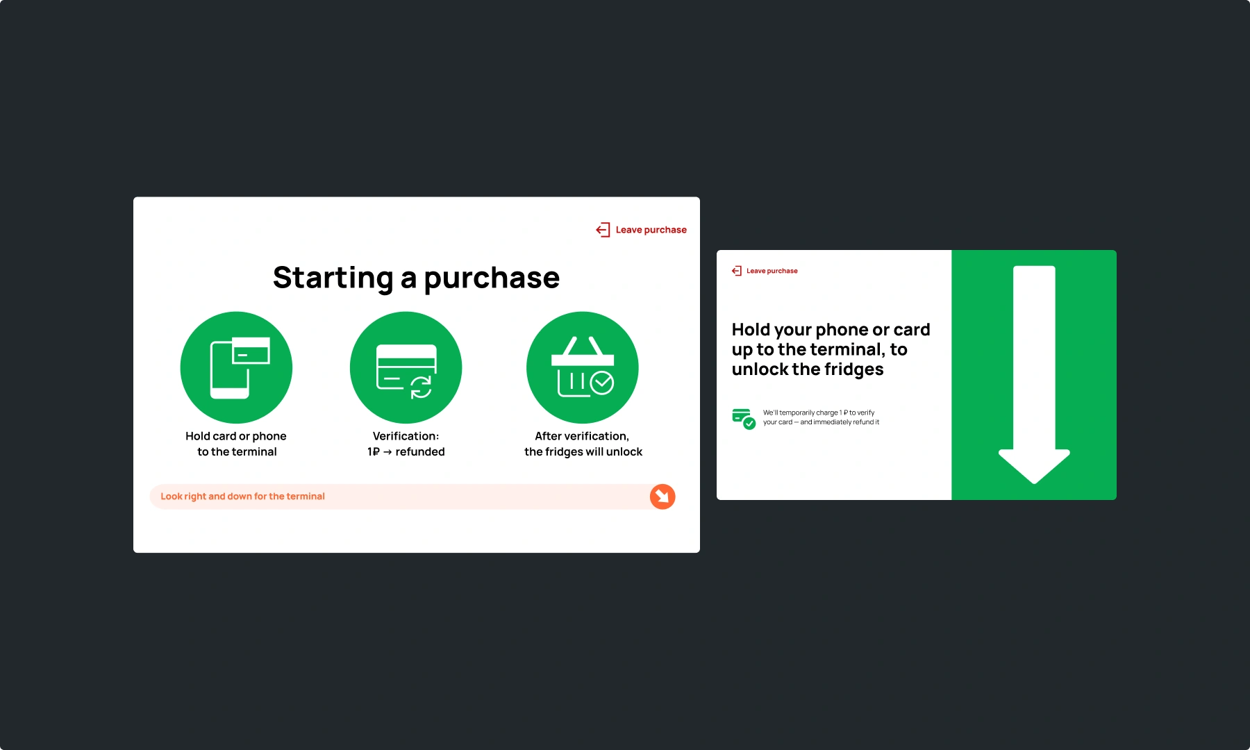
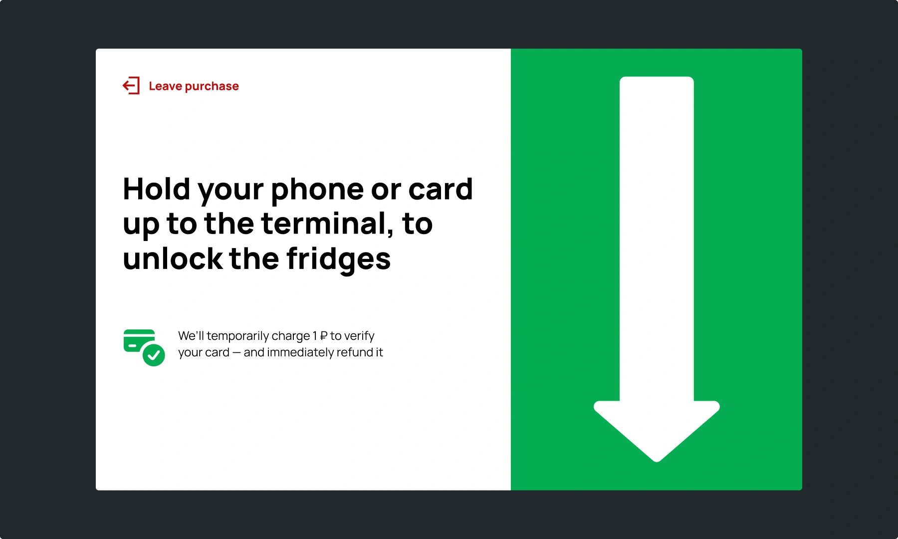
The next step was explaining how to actually open the fridges. I initially tried a structured onboarding screen with icons explaining the card tap and temporary hold charge. While it looked clean in Figma, it failed in the real world. In a fast-paced physical environment, people don't want to read a story; they just want their food. The icons were too abstract for first-time users, leading to hesitation and annoyance.
This taught me that explanatory onboarding is useless here. The less abstract the cues, the better.
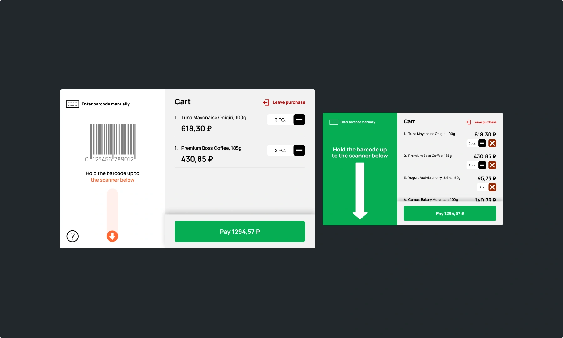
The cart was the next battleground. Users kept trying to scan items against the tablet screen instead of the actual barcode reader. I fixed this by ditching the subtle hints for huge, full-screen directional arrows and colour cues. It forced a physical connection between the screen and the hardware without requiring the user to think.
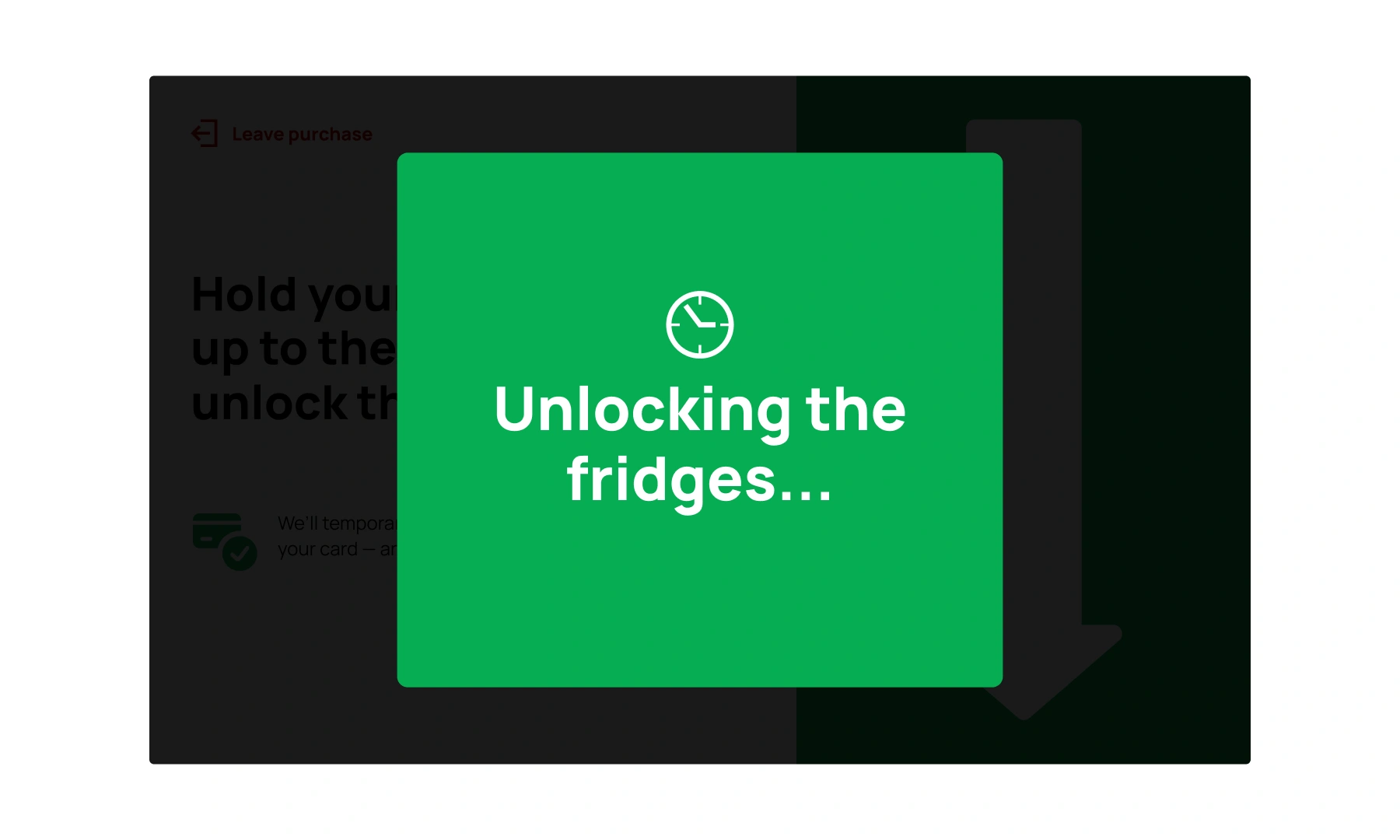
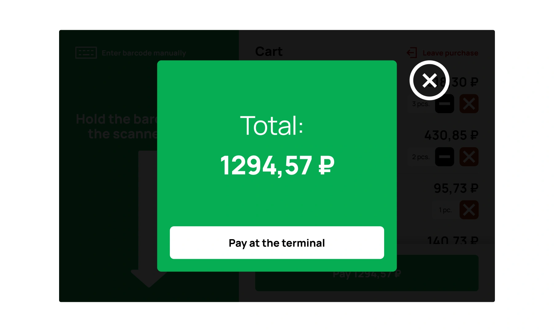
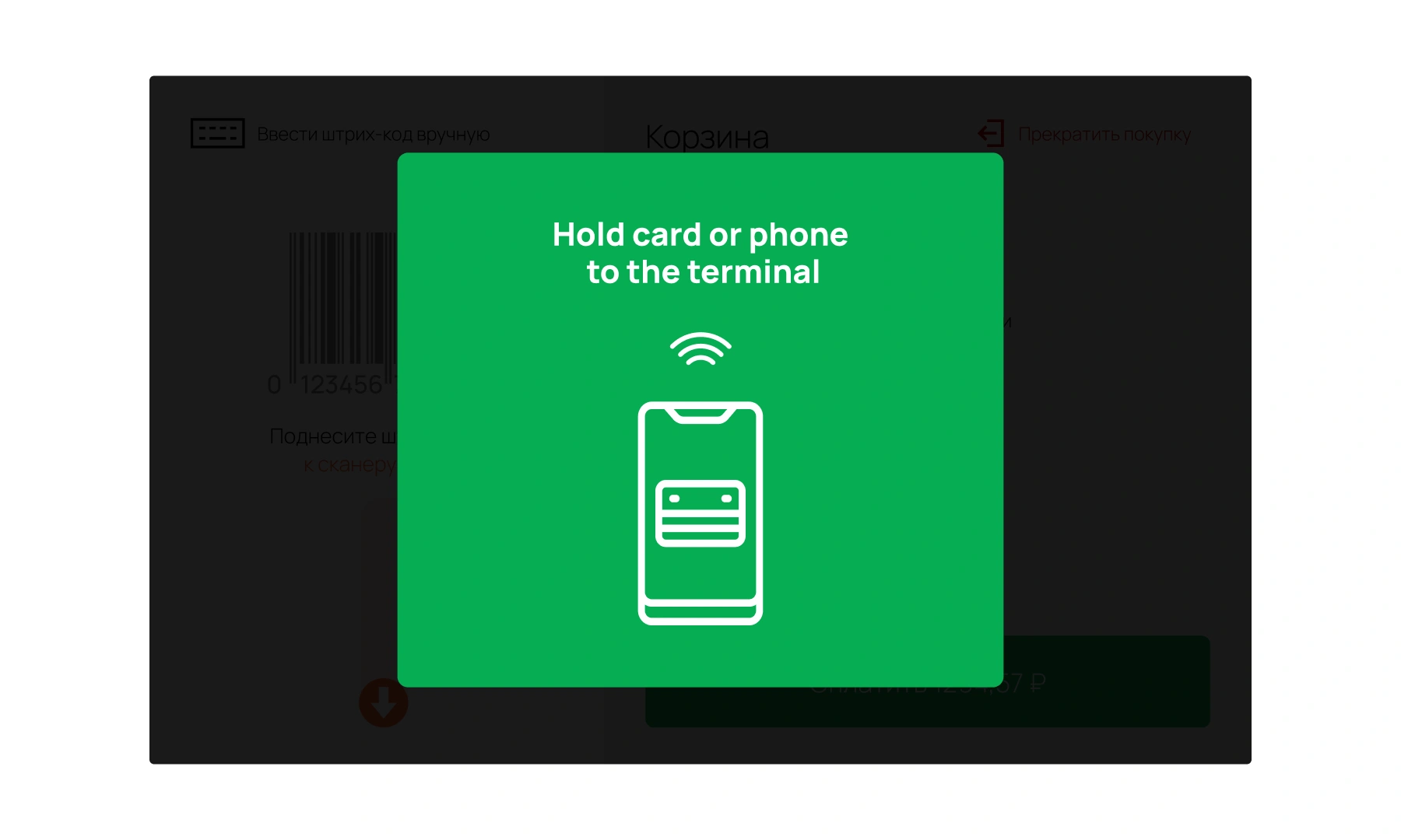
I also implemented clear loading states for backend delays. When the system was processing a payment or unlocking doors, the UI finally gave visible feedback, preventing users from assuming the machine had frozen.


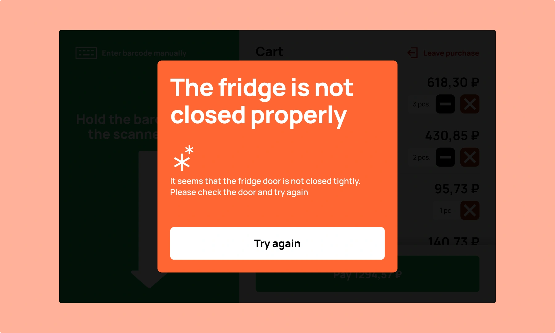
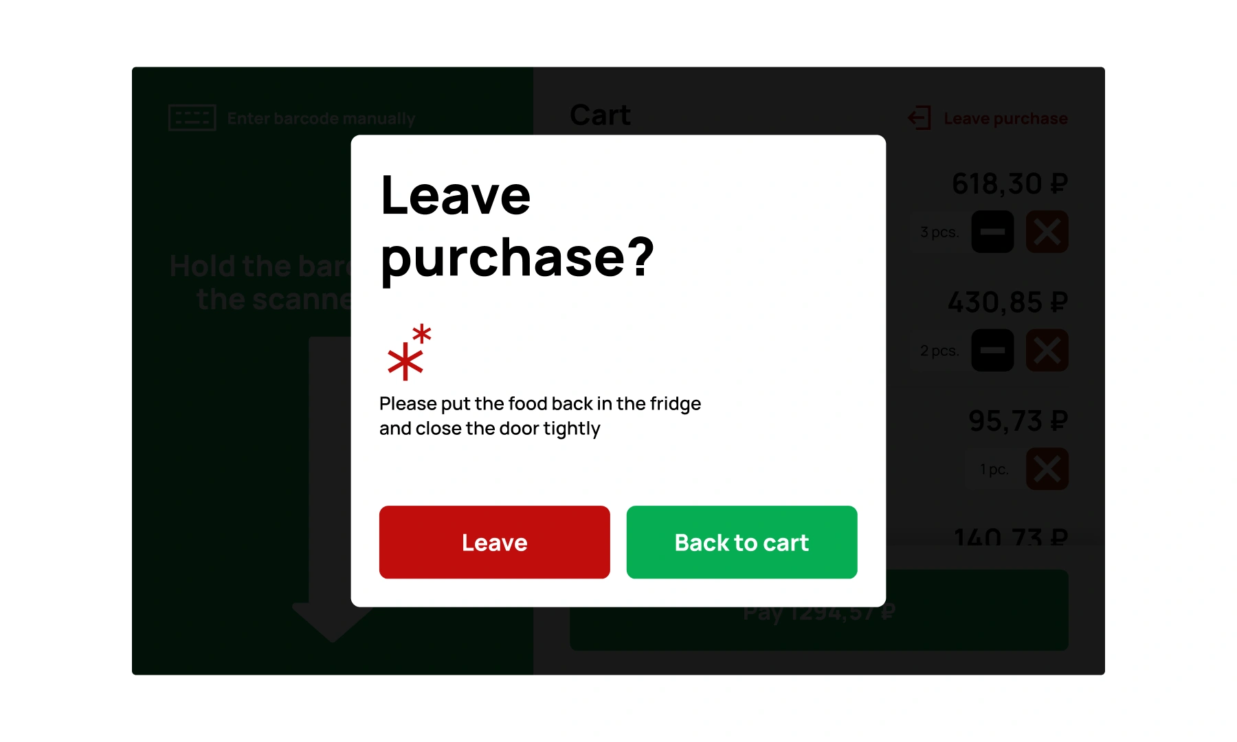
The impact was immediate. Within the first month, we saw a significant drop in support complaints and a 21.8% increase in completed purchases. By stripping away the abstract "onboarding" and using literal directional cues, we slashed the average purchase time. The project proved that on outdated hardware, a direct, aggressive UI is the only way to compete with the convenience of delivery apps.