Checkout That Works Without Second-Guessing
Redesigned the checkout to feel quick, simple, and easy to follow so people could buy what they want without getting stuck.
Nov 2020 – Mar 2021
PERIOD
Blizko Markets
COMPANY
#Retail #Selfchekout #Accessibility
TAGS

About this project
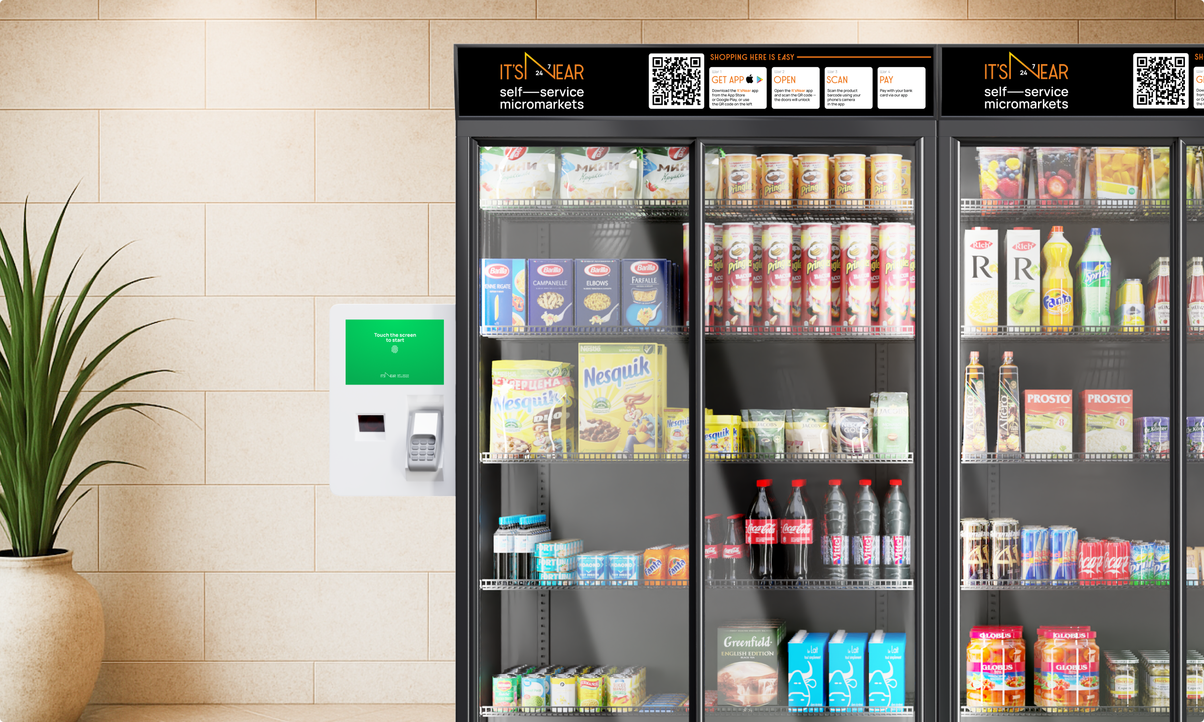
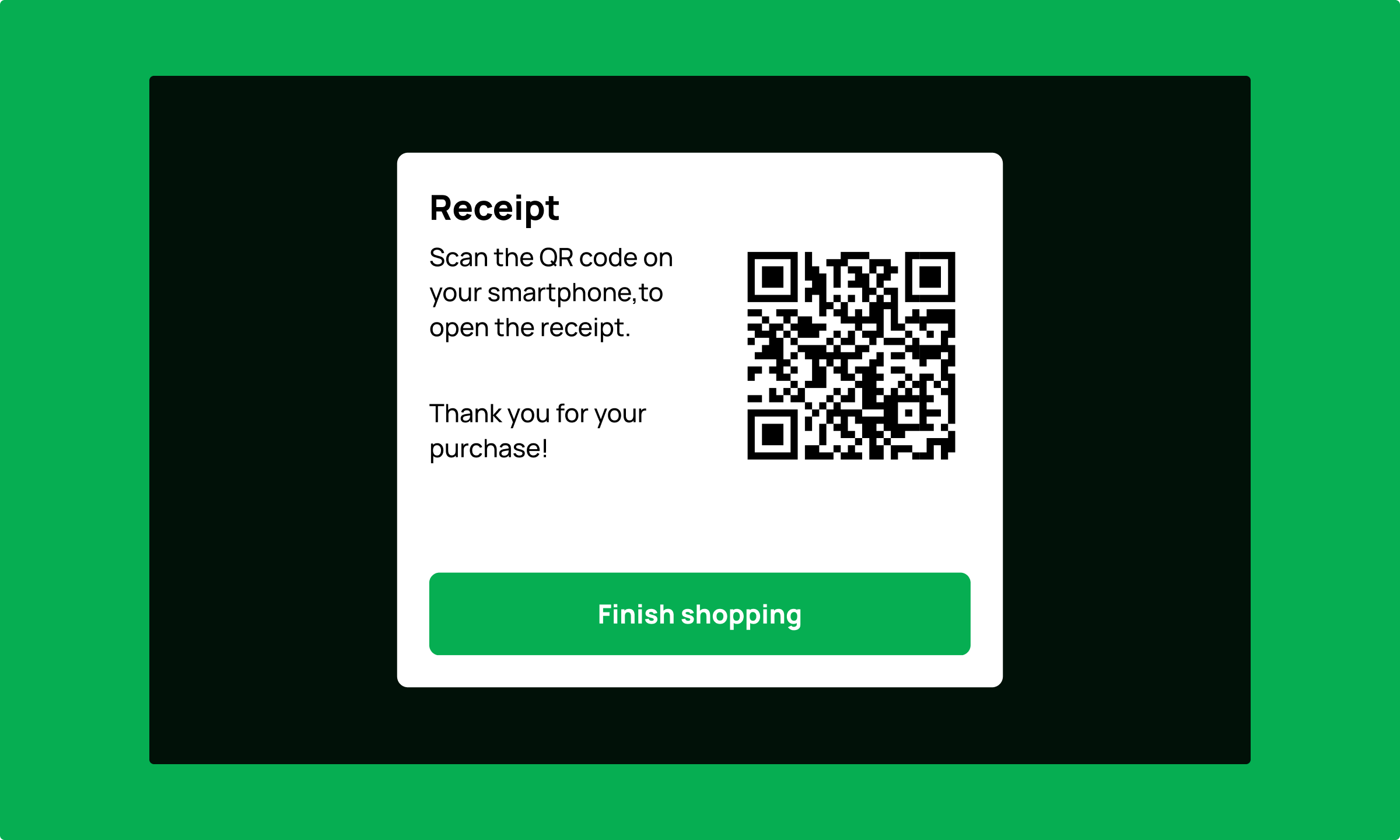
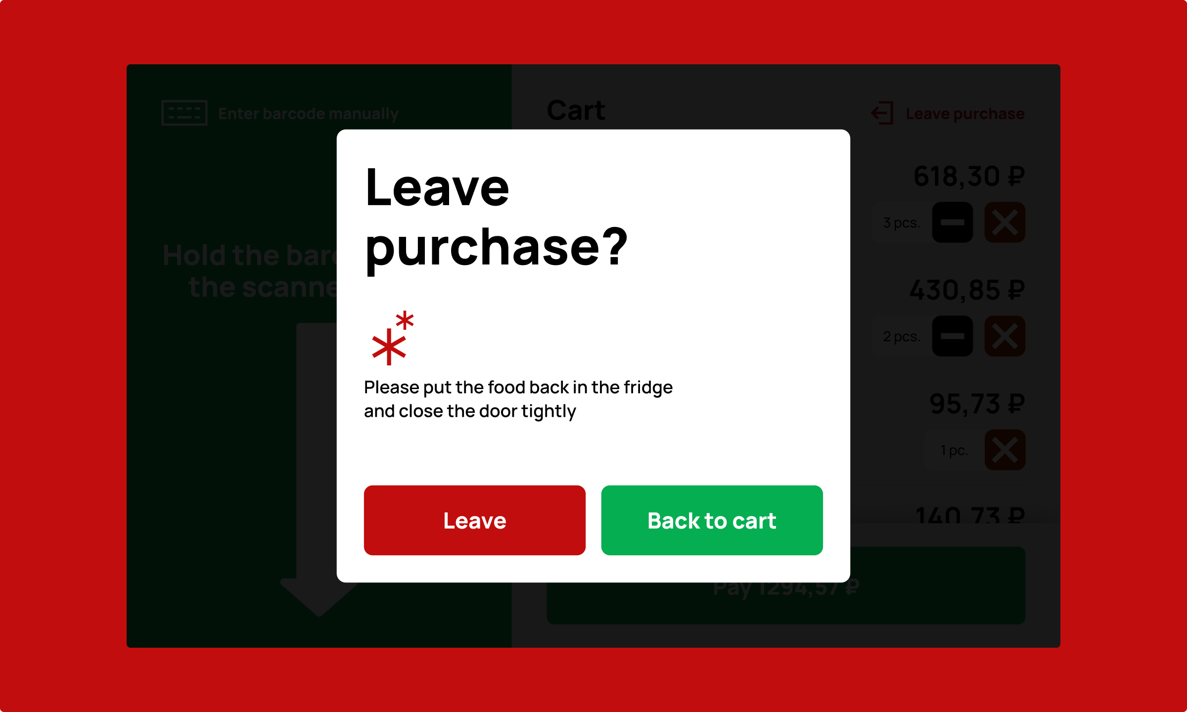
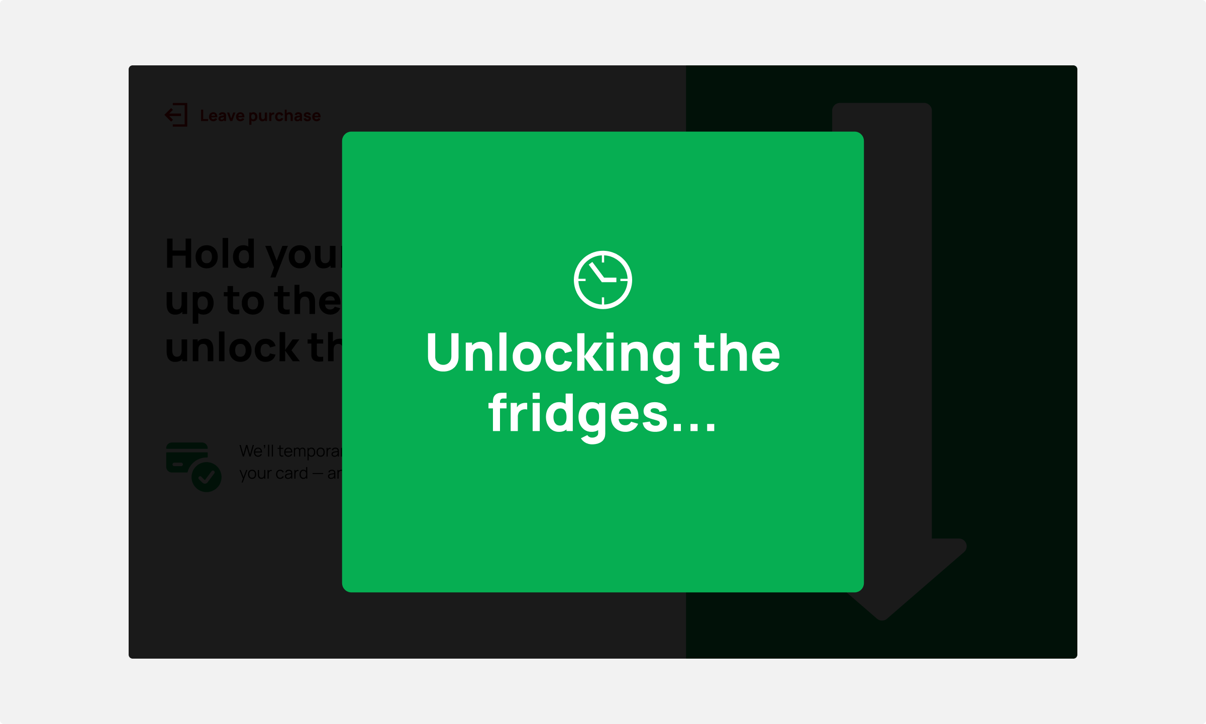
Blizko is a self-checkout micromarket found in places like hotel lobbies and campus buildings. Originally there was no real interface: just a developer-made screen with a few buttons and no clear flow. It technically worked, but it wasn’t built with users in mind. The setup was fine if you’d used it before, but for anyone new, things didn’t always make sense: how to start, where to scan, when the fridge would unlock. Since even a few seconds of hesitation could make someone give up, turn around, and walk away, the goal was to make the whole thing quicker, clearer, and easier to trust.
Any challenges?
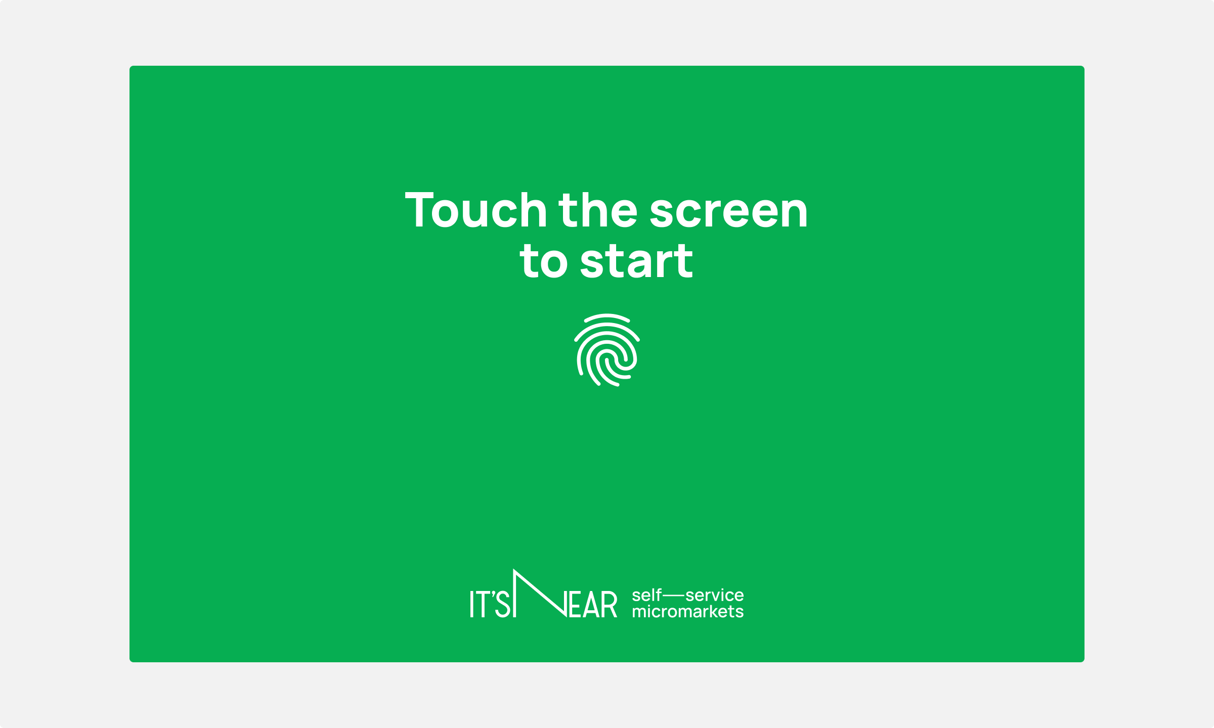
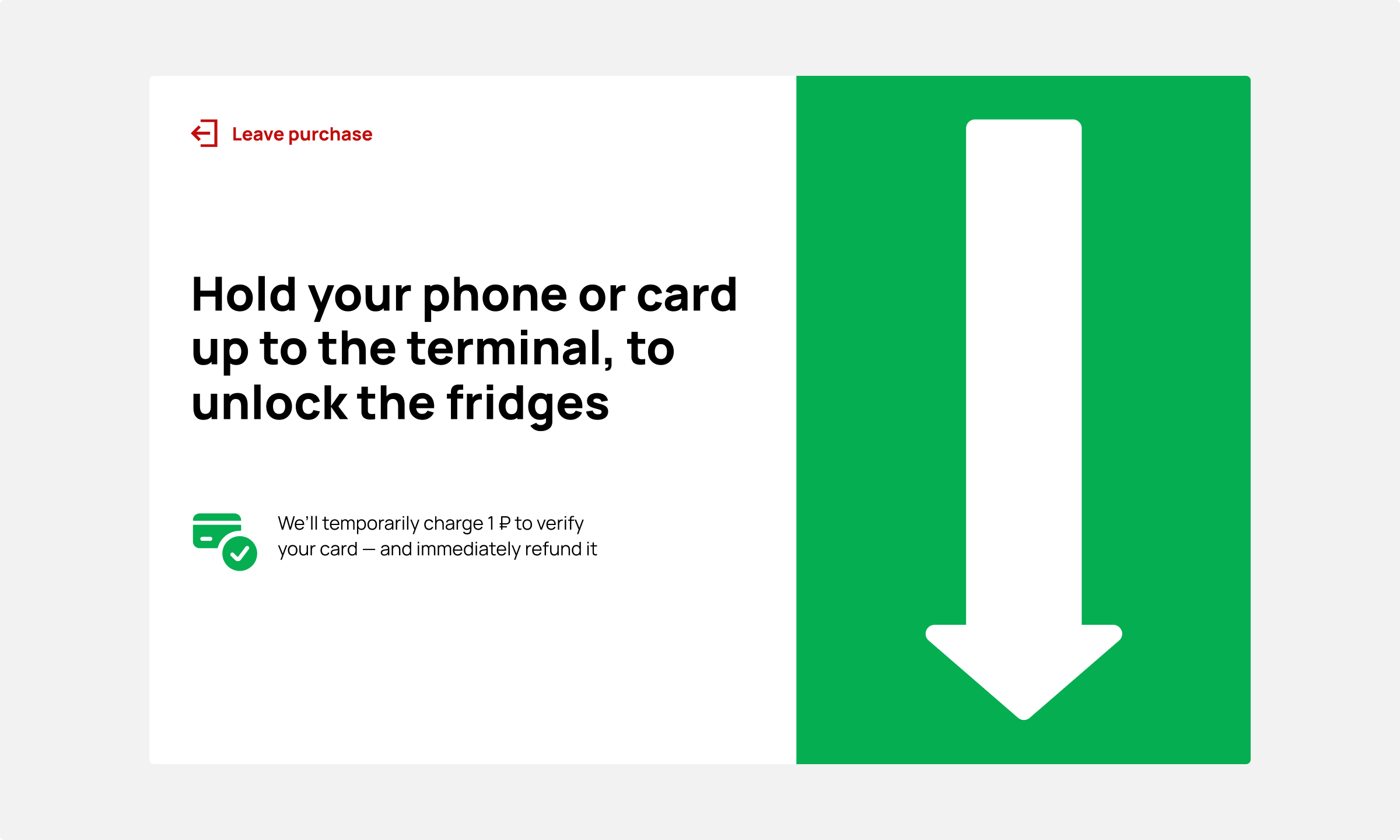
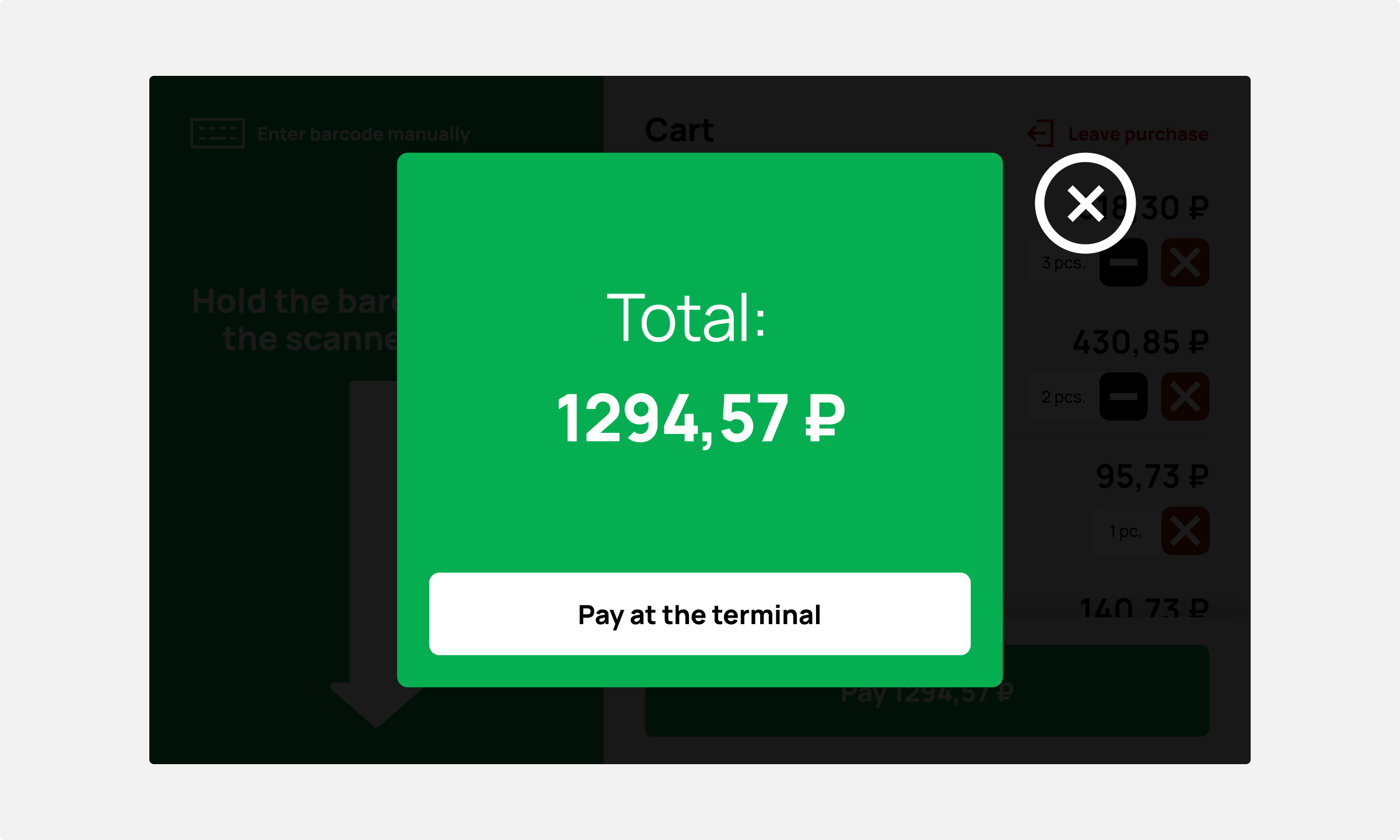
I worked on the redesign from start to finish. We started by looking at how people interacted with the old interface, and also studied other checkouts across major supermarket chains in Saint Petersburg to see how different systems worked.The hardest part was making the screen and the physical setup feel like one thing — not just cleaning things up but guiding people through it without stopping to think. We solved this by using bright colour zones to show what to focus on, short prompts to tell you what to do, and oversized icons or arrows to point exactly where to look, even if you’d just turned away for a second. It took a few tries to land, but we got there in the end: people followed the on-screen instructions naturally, without second-guessing.


Highlights
The first version already shaped the experience and made the process feel natural. We kept going, tested more ideas, and by the third round it was clear: fewer pauses, faster checkouts, more purchases. The redesign was bold on the surface, but it did exactly what it should — people walked up, scanned their Coke Zero™ and avocado sandwiches, tapped their card and went on with their day without ever noticing the interface at all.